Adventures of a pop-up in the Runet or 4 years of our practice
In this article I will talk about how our company began to implement services based on pop-UPS and what came of it. The article will be useful to those who propose pop-UPS or going to do it, and help make the decision for those who have doubts – whether to use such algorithms.
a Little history
Initially, in 2011, Leadhit was created as a marketing platform HubSpot Western type. After six months of development we realized that to sell this idea will be very difficult - the market still doesn't understand why the need for such services. Then we took the first pivot, turning to the "smart mailing", which quickly segmented the audience based on their history and allowed the visitor to make a specific proposal on your e-mailing.
In the first version of pop-UPS and it was not. The idea was to offer the market a convenient and efficient tool for identification on the website of interests of visitors and the subsequent development of email companies on a segmented basis taking into account the following: interests of visitors to the commodity groups, the purchase or the lack of activity of visitor, frequency of purchases and visits and much more. However, this good idea has failed miserably. We are unable to sell? The market does not want to buy? Not ready to answer these questions. Talking with marketers, we realized that they wanted not a tool with which you want to work independently, and ready-made solution. Which is guaranteed to bring results, but it does not need to do anything it is Curious that in 2015 the market began to appear the tools that we tried to implement in the distant year of 2012.
But I want to eat, and had to invent next. We did the second pivot and the first widget: subscription form. But there has not been without side effects — it only collected email and nobody wanted it. The percentage of completeness was high, but the part visitors see the popup irritating nuisances, and collected email bad converted into orders. And then at the end of 2012 was a "Banner of last resort", now called "Smartoffers" that combined two tools — widgets and trigger the relevant distribution.
So it looked in 2012:
 alt="image"/>
This pop-up at the exit site (exit intent), and NOT perfect purchase.
After that, visitors have received such a letter. Do not judge strictly – cons we know ourselves. By cons can be attributed to the delivery time – it only came through 20 minutes.
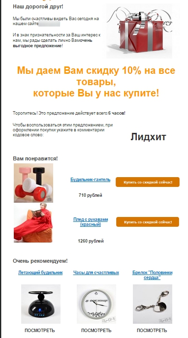
There was a small problem – banner not appearing periodically, as the meter and the picture was too heavy. And the algorithms show in General left much to be desired, there was virtually no settings to tailor the banner for the specific website did not work. Besides adblock and adguard us from not very loved, and Yandex.market, as it turned out, not happy with the behavior on the sites. And duration of delivery of the letter reduced the number of orders. But there were advantages-achievements. The letter contained the goods that the recipient was interested in on the website. It was the most functional component of the original idea. In addition, we changed the name – the original "Banner of last hope" has become a "Smart offer", that went product to use, because it is not perceived as pop-up, and sell the idea it became easier.
However, sales became both easier and harder. Part of the potential clients perceived our service as a "boxed product" that does not require a lot of attention and worries, and yielding the result. For the rest, it was "fu, pop-up". However, with all the obvious advantages of this instrument even today we are faced with such an attitude.
results: in spite of all difficulties, we managed to increase sales to several key customers by 10%. And that's just at the start of the service, when it was still raw. The number of completed forms on the basis of which was formed by subscriber base, is also pleased.
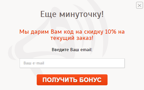
What happened: we have done a lot of work on the algorithms show that the optimization of the counter, rate of return, over images and typography widgets, their weights and correctness, and also found a solution for Yandex.market, to impose the layouts of letters, optimized reporting and CTR of emails, etc.
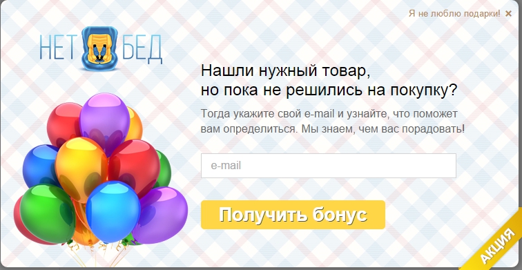
summary:
Widgets were adapted to the sites, download speed meter and pictures amounted to hundredths of a second, adblock and adguard is fine with us getting along, Yandex.the market no longer makes remarks to our clients, messages arrive almost instantly after you submit the form, and they became almost perfect.
What changed in the statistics
If you start from the statistics one of our best projects can be rightly proud of a long and successful path we have done over the years. To date, the efficiency is 27% growth in the number of transactions. And it's because of "EW, pop the sprog".
Important point – motivation in letters. We have long thought on this point. Call the recipient to return to the site must be accompanied by a promise of some benefit. Discount % or rubles, gift, free shipping, money to the mobile phone — which is better? But a few years of practice, we realized that there is no universal recipe. You just have to test and pick up. The same segments we had completely different values with exactly the same incentives and promotions. It is necessary to try and look for the best, and periodically change the concept.
Conclusions:
Working with pop-UPS is not the easiest niche and activity. However, in this direction it is possible to live and develop, and with proper settings and correct approaches can achieve excellent results. Over 2 years of development in this direction was done:
• The algorithm for displaying virtually eliminates the possibility of "cannibalism" and most loyal.
• Complaints about the obsession stopped. On average we display banners 20-30% visitors solely interested without irritating the rest of the audience. Although, in this regard, the decreased percentage of occupancy forms, but increased the percentage of conversion through demonstration of the widgets of the target audience.
• Letters come quickly contain relevant goods and looks the most attractive and construed in accordance with the criteria of "the perfect letter" (on that we continue to work).
We shared our experiences, which can be useful primarily for those who want to sell services related to pop-UPS. Before launching such a service, think how, who and why show pop-UPS. What happens after registration. And let it "after making" will be the best quality.
Article based on information from habrahabr.ru
a Little history
Initially, in 2011, Leadhit was created as a marketing platform HubSpot Western type. After six months of development we realized that to sell this idea will be very difficult - the market still doesn't understand why the need for such services. Then we took the first pivot, turning to the "smart mailing", which quickly segmented the audience based on their history and allowed the visitor to make a specific proposal on your e-mailing.
In the first version of pop-UPS and it was not. The idea was to offer the market a convenient and efficient tool for identification on the website of interests of visitors and the subsequent development of email companies on a segmented basis taking into account the following: interests of visitors to the commodity groups, the purchase or the lack of activity of visitor, frequency of purchases and visits and much more. However, this good idea has failed miserably. We are unable to sell? The market does not want to buy? Not ready to answer these questions. Talking with marketers, we realized that they wanted not a tool with which you want to work independently, and ready-made solution. Which is guaranteed to bring results, but it does not need to do anything it is Curious that in 2015 the market began to appear the tools that we tried to implement in the distant year of 2012.
But I want to eat, and had to invent next. We did the second pivot and the first widget: subscription form. But there has not been without side effects — it only collected email and nobody wanted it. The percentage of completeness was high, but the part visitors see the popup irritating nuisances, and collected email bad converted into orders. And then at the end of 2012 was a "Banner of last resort", now called "Smartoffers" that combined two tools — widgets and trigger the relevant distribution.
So it looked in 2012:
 alt="image"/>
This pop-up at the exit site (exit intent), and NOT perfect purchase.
After that, visitors have received such a letter. Do not judge strictly – cons we know ourselves. By cons can be attributed to the delivery time – it only came through 20 minutes.

There was a small problem – banner not appearing periodically, as the meter and the picture was too heavy. And the algorithms show in General left much to be desired, there was virtually no settings to tailor the banner for the specific website did not work. Besides adblock and adguard us from not very loved, and Yandex.market, as it turned out, not happy with the behavior on the sites. And duration of delivery of the letter reduced the number of orders. But there were advantages-achievements. The letter contained the goods that the recipient was interested in on the website. It was the most functional component of the original idea. In addition, we changed the name – the original "Banner of last hope" has become a "Smart offer", that went product to use, because it is not perceived as pop-up, and sell the idea it became easier.
However, sales became both easier and harder. Part of the potential clients perceived our service as a "boxed product" that does not require a lot of attention and worries, and yielding the result. For the rest, it was "fu, pop-up". However, with all the obvious advantages of this instrument even today we are faced with such an attitude.
results: in spite of all difficulties, we managed to increase sales to several key customers by 10%. And that's just at the start of the service, when it was still raw. The number of completed forms on the basis of which was formed by subscriber base, is also pleased.

What happened: we have done a lot of work on the algorithms show that the optimization of the counter, rate of return, over images and typography widgets, their weights and correctness, and also found a solution for Yandex.market, to impose the layouts of letters, optimized reporting and CTR of emails, etc.

summary:
Widgets were adapted to the sites, download speed meter and pictures amounted to hundredths of a second, adblock and adguard is fine with us getting along, Yandex.the market no longer makes remarks to our clients, messages arrive almost instantly after you submit the form, and they became almost perfect.
What changed in the statistics
If you start from the statistics one of our best projects can be rightly proud of a long and successful path we have done over the years. To date, the efficiency is 27% growth in the number of transactions. And it's because of "EW, pop the sprog".
Important point – motivation in letters. We have long thought on this point. Call the recipient to return to the site must be accompanied by a promise of some benefit. Discount % or rubles, gift, free shipping, money to the mobile phone — which is better? But a few years of practice, we realized that there is no universal recipe. You just have to test and pick up. The same segments we had completely different values with exactly the same incentives and promotions. It is necessary to try and look for the best, and periodically change the concept.
Conclusions:
Working with pop-UPS is not the easiest niche and activity. However, in this direction it is possible to live and develop, and with proper settings and correct approaches can achieve excellent results. Over 2 years of development in this direction was done:
• The algorithm for displaying virtually eliminates the possibility of "cannibalism" and most loyal.
• Complaints about the obsession stopped. On average we display banners 20-30% visitors solely interested without irritating the rest of the audience. Although, in this regard, the decreased percentage of occupancy forms, but increased the percentage of conversion through demonstration of the widgets of the target audience.
• Letters come quickly contain relevant goods and looks the most attractive and construed in accordance with the criteria of "the perfect letter" (on that we continue to work).
We shared our experiences, which can be useful primarily for those who want to sell services related to pop-UPS. Before launching such a service, think how, who and why show pop-UPS. What happens after registration. And let it "after making" will be the best quality.
Комментарии
Отправить комментарий