Typographicum names
There is nothing easier than to place cities or countries alphabetically, to filter them by the first two letters, or to search by name. A visual representation always coincides with the expectation.
I always know what the city of Tyumen is located somewhere at the bottom of the list and always selecting painless scroling to the end...
Unfortunately the same cannot be done in the case of names of organizations. By themselves, the lists look disgusting, they are unpredictable, poorly sorted, and to work with them need maximum visual concentration.
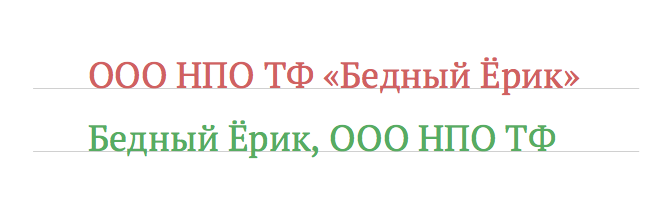
Once in the title, I used the "Tipografia", it is not a sin to find fault and to form quotation marks, which are usually manipulated by the users (although I would rather insisted on uniformity).
Lists are lists, they still come. The root of all evil lies in the very title and in the skills they recruit.
Main problems:
the
Typing in upper case (ADMINISTRATION of ABATSKY MUNICIPAL DISTRICT).
a Large number of legal forms (JSC, CJSC, etc.), and someone writes an abbreviation, but someone with explanation;
a Large number of related abbreviations (NPO TF "Apply science").
No ability to filter the companies by name or conduct a direct search, so they all start with LLC, IP and a dissonance when the filter choose company "A", but they really start to "On".
Quotes. Even if I know how the recorded name of the company, you never know in what form it is framed by quotation marks, whether quotation marks generally and whether there is nested.
Communism in names. It is impossible to reduce or to remember, they break any layout, and attempts to somehow hide the extra characters, kill the uniqueness of the name. For example: "West-Siberian branch of Federal state budgetary institution of science Institute of petroleum Geology and Geophysics. A. A. Nikolay Siberian branch of the Russian Federation Academy of Sciences".
Spelling mistakes and language "padonkaf" in the names of Eric, Yoriko, Ereg is Yorick, Tapochki instead of Slippers. Registered bodies do not especially bother to check (thanks to merlin-vrn in addition).
The first problem can be solved only by education, for example, validate field and to warn about the preferred input format. The last two unfortunately can not be solved, they in the mind, but with all the other problems I can work with.
Change the paradigm of the form
If your interface works with the names of the organizations, one field is not enough, the minimum option is two. Output documents to print correctly with the full name, but to display in the interface, or to search better for short.
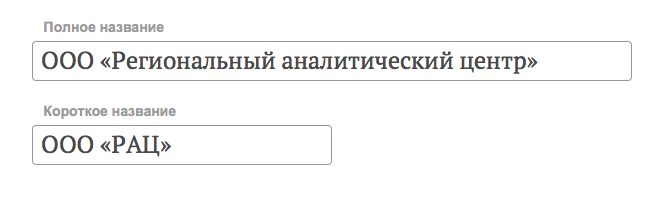
It is worth noting that under the legislation the company can be registered up to 4 titles: a complete, short and names in various translations.
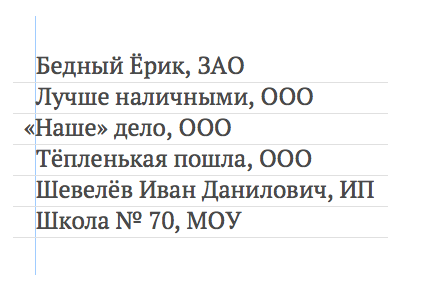
At the input stage makes sense to parse the name into parts for convenient storage. A good option to break on the title, ownership, prefix and Postfix. In the future, when output to screen or print, you can easily concatenate the parts received in any order. This is especially true for lists.
The only thing to remember while parsing — nested quotes. They need to do carefully and in the layout you are required to hang.
digression
Foreign companies are typeset in reverse order: Niantic, Inc.; Public Image, Ltd, and nobody will prevent us to register their business with the location of the parts in this order: My firm, LTD.
Maybe it will break accounting and tax software, but I think that it is high time to change something.
How to disassemble a name?
-
the
- Remembering that usually the name is not administered, a copy and paste from the card company, you need to remove from it all unnecessary whitespace. the
- Replace all decrypt organizational-legal forms and types of liability for abbreviations and to transfer them to the end of the name. the
- Allow single quotes to mind, remove the ones that frame the entire name and leave only the nested.
I wrote a small script (beautyCo.js), which performs these actions. He does not claim to be a genius, but can be useful in simple cases, or be a starting point for something bigger.
Rake
In the process of working on the script encountered another problem of Latin characters "double".
In order to save time, users do not bother to redial has already begun in the Latin layout phrases, they switched to the Cyrillic alphabet and continue to write on:
OOO "Raduga"
In this title, only two Cyrillic sign, and therefore the search, and parsing of names is difficult, although in print and on the screen everything seems fine.
I had to write a small script (antiPE.js) that changes the characters "double" to normal. He is not able to recognize the language of the text, Yes, it is not necessary, because in the Russian Federation, all names must be in Russian (according to paragraph 3 of article 1473 of the civil code).
I hope my experience will help you solve your interface challenges!


Комментарии
Отправить комментарий